
Article
Build a Recruiting Analytics Dashboard TA Teams Can Ship in 30 Days

Build a Recruiting Analytics Dashboard TA Teams Can Ship in 30 Days
A recruiting analytics dashboard is a single-pane view of your hiring funnel, sourcing performance, and team output, built so anyone can spot a bottleneck without pulling a spreadsheet. The right starting layout is simple: one executive overview screen showing top KPIs and trend lines, paired with a funnel view that shows exactly where candidates drop off. Everything more advanced comes later.
TL;DR:
- Tracking source of hire and channel ROI helps identify costly channels with high application volume but low conversion to hires.
- Building the dashboard in phases, starting with candidate IDs and funnel views, prevents trust issues caused by messy data.
- Daily refreshes are essential for operational monitoring, while weekly updates suit strategic trend analysis for leadership.
- Core KPIs should include time-to-fill, funnel stage conversions, cost per hire, and source performance for actionable insights.
- Small teams can begin with a spreadsheet, but scalable platforms like JobsAI Enterprise streamline data integration and dashboard reliability.
Table of Contents
- What a Recruiting Analytics Dashboard Is and Why It Matters
- Core Recruiting KPIs Your Dashboard Should Track
- Dashboard Layouts and Templates You Can Build This Week
- How to Implement a Recruiting Analytics Dashboard
- Visualization Rules That Keep Dashboards Honest
- Turning Dashboard Data Into Action
- How JobsAI Enterprise Supports Recruiting Analytics
- What I’d Prioritize If I Were Launching a Dashboard Today
- Try JobsAI Enterprise: See the Dashboard in Action
- Sources
- FAQ
What a Recruiting Analytics Dashboard Is and Why It Matters
A recruiting dashboard is a visual interface built around KPIs, benchmarks, and goals, meant to give a snapshot of hiring performance at a glance and flag where speed, cost, or quality need attention, according to NetSuite’s overview of recruitment analytics. That sounds simple, but the value shows up differently depending on who’s looking at it.
A TA leader wants trend direction: is time-to-fill climbing quarter over quarter, and which req types are dragging it down? A recruiter wants operational detail: which candidates are stalled in a stage past their SLA, and who needs a follow-up today. A hiring manager mostly wants to know if their req is on track, without needing to ask.
Three outcomes tend to show up first once a team actually uses a dashboard instead of just building one:
- Faster hires, because stalled stages get flagged before they become a 40-day gap nobody noticed
- Better quality signals, because you can finally connect source and interview data to who actually performs after hire
- Lower cost per hire, because underperforming channels get cut instead of funded out of habit
Here’s the part most guides skip: you do not need an enterprise platform on day one. A small team hiring under 50 roles a year can run a clean dashboard in a spreadsheet with three tabs. The complexity curve should track hiring volume and the number of stakeholders asking for reports, not the other way around. Teams that buy a heavyweight analytics platform before they have consistent data feeding it usually end up with a dashboard nobody trusts.
Core Recruiting KPIs Your Dashboard Should Track
Recruiting dashboards commonly track a fairly consistent set of metrics: time-to-hire, offer acceptance rate, stage-specific drop-off, source-of-hire performance, and recruiter productivity, with more advanced platforms layering in predictive forecasting on top, per AIHR’s research on recruitment dashboards. Getting these right matters more than getting all of them.
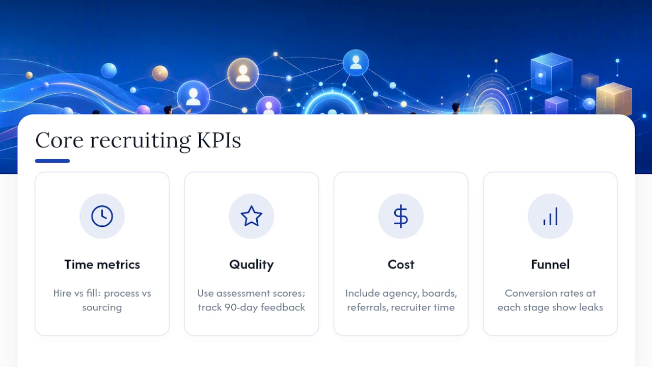
Time-to-hire vs. time-to-fill. These get confused constantly. Time-to-hire measures from the moment a candidate applies to the moment they accept an offer, so it tells you about your process speed. Time-to-fill measures from when a req opens to when it’s filled, so it captures sourcing lag too. If time-to-fill is high but time-to-hire is fine, your problem is top of funnel, not your interview process.
Quality of hire. This is the metric everyone wants and almost nobody measures well, because the real signal (retention, performance ratings) lags months behind the hire date. Use early indicators instead: assessment scores at the interview stage, and how offer-stage performance correlates with 90-day manager feedback once you have enough data to look back on.
Cost per hire. Include agency fees, job board spend, referral bonuses, and a reasonable allocation of recruiter time. Most teams undercount this by leaving out internal labor cost, which makes cheap-looking channels look better than they are.
Funnel conversions and stage drop-off. Put this front and center, not buried. A funnel view that shows conversion rate from applied to phone screen, phone screen to onsite, onsite to offer, and offer to accept will surface leak points a summary number never will.
Source-of-hire and channel ROI. Track applicants, hires, and cost by channel side by side. A channel that produces a lot of applicants but few hires is expensive in disguise.
Candidate experience. Candidate Net Promoter Score is the closest thing recruiting has to a standardized sentiment metric, and industry benchmarks put a healthy Candidate NPS somewhere between 30 and 40. Below a reasonable NPS range, expect it to show up later as declining offer acceptance and weaker referral flow. Our guide to tracking candidate engagement walks through how to collect this signal without adding another survey nobody fills out.
Pro Tip: Rank your KPIs by decision, not by interest. If a metric wouldn’t change what you do next week, it belongs in a monthly report, not your daily dashboard view.
Dashboard Layouts and Templates You Can Build This Week
You don’t need to design from scratch. Four layouts cover almost every recruiting analytics need, and each one maps to a specific audience question.
- Executive overview. Top KPIs as large numbers (open reqs, time-to-fill, offer acceptance rate, cost per hire) with a small trend sparkline under each one. This is the screen a TA leader glances at for ten seconds before a leadership meeting.
- Hiring funnel view. A funnel chart or Sankey diagram showing candidate volume at each stage, next to a table with stage-by-stage conversion rates. This is where bottlenecks get caught early.
- Source performance view. A breakdown by channel showing applicant volume, hires, cost per hire, and conversion rate side by side, so a channel that looks cheap on cost-per-applicant but expensive on cost-per-hire gets caught.
- Recruiter performance view. Time-in-stage by recruiter, throughput (reqs closed per month), and SLA adherence. Handle this one carefully; it should coach, not shame.
For starter templates, you have real options at every budget level. Excel or Google Sheets works fine for volumes under a few hundred candidates a year, especially with pivot tables built off a clean candidate export. Power BI or Tableau makes sense once multiple stakeholders need self-serve filtering. For teams comfortable with a little code, open-source projects like Streamlit and Plotly recruitment dashboards let you upload a CSV and get an interactive funnel and KPI view running in an afternoon, no license required — or you can explore platforms like Vetros · the Data Product Builder to build dashboards and data products with ease. Whichever route you pick, the columns you need are consistent: candidate ID, source, stage, stage-entry date, stage-exit date, req ID, and outcome.
How to Implement a Recruiting Analytics Dashboard
The build itself is rarely the hard part. Getting clean, connected data into it is.
Start with the data sources that matter most and connect them in this order:
- Your applicant tracking system (ATS), since it holds stage history and candidate flow
- Your HRIS, for headcount, offer, and start-date confirmation
- Sourcing platforms and job boards, for applicant volume and channel attribution
- Offer and e-signature systems, for time-to-accept and offer decline reasons
- Candidate surveys, for the sentiment layer that raw pipeline data can’t give you
Field mapping is where most dashboard projects quietly break. Every system needs to reference the same canonical candidate identifier, or you’ll end up double-counting people who applied through two channels. Our breakdown of how recruiters organize applicant data covers this in more depth, but the short version is: pick one ID standard before you connect a second system, not after.
Common data-quality problems worth checking for early: duplicate candidate records from multiple application channels, stage names that don’t match across systems, and missing timestamps on older records that make time-in-stage calculations unreliable. Fix the ID and stage-mapping issues first; everything downstream depends on them.

Refresh cadence should match how the data gets used. Daily refresh works for operational views recruiters check for stalled candidates and SLA breaches. Weekly is usually enough for strategy-level trend reviews. Governance matters here too: recruiter-level performance data and candidate personal information should sit behind role-based access, not sit open on a shared dashboard link.
Visualization Rules That Keep Dashboards Honest
Order matters more than most people assume. Put KPIs at the top, the funnel in the middle, and driver breakdowns (source, recruiter, req type) at the bottom. That order matches how people actually scan: headline first, then where the problem lives, then why.
Match the chart to the question, not to what looks impressive:
- Trendlines for anything tracked over time, like time-to-fill by month
- Funnel charts for stage conversion and drop-off
- Heatmaps for spotting patterns across multiple reqs or recruiters at once
- Cohort views for comparing candidates who entered the pipeline in the same month, which controls for seasonal noise
Design the same underlying data two ways depending on the audience. A TA leader wants aggregated trends across the whole org. A recruiter wants their own open reqs and stalled candidates, filtered down to just them. Trying to serve both audiences with one generic view usually satisfies neither.
Always label the sample size and date range on a chart, especially for anything broken out by source or recruiter. A 90% offer acceptance rate means something different on 4 offers versus 40. And check that whatever you build actually renders on a phone. Recruiters checking pipeline status between interviews aren’t opening a laptop to do it.
Turning Dashboard Data Into Action
A dashboard that nobody acts on is a reporting exercise, not an analytics tool. The fix is building it into a rhythm, not a one-time review.
- Run weekly standups off the funnel view. Fifteen minutes, focused on stalled candidates and stage-conversion drops, not a full metrics recap.
- Reserve monthly reviews for strategy. This is where source ROI, cost-per-hire trends, and recruiter capacity get discussed with leadership.
- Set alert thresholds, not just dashboards to check manually. A candidate sitting in “offer extended” for more than five days, or a stage-conversion rate dropping 15 points month over month, should trigger a notification, not wait for someone to notice.
- Tie thresholds to decision rules. If cost-per-hire on a channel exceeds your target for two straight months, that’s the trigger to pause spend, not a discussion point.
- Feed the same data into forecasting. Historical time-to-fill by req type is the input that makes capacity planning for next quarter’s hiring plan realistic instead of guesswork.
How JobsAI Enterprise Supports Recruiting Analytics
Some talent acquisition platforms build analytics directly into the hiring workflow instead of bolting a reporting layer onto a separate ATS. When sourcing, screening, and candidate communication run through one workspace, executive dashboards can pull from a single canonical candidate record instead of reconciling exports from multiple tools.
In practice, a talent acquisition platform may offer features such as predictive forecasting and stage analytics based on live pipeline data rather than weekly exports. Integrations with existing ATS, CRM, email, and calendar tools can reduce field-mapping work. Executive dashboards and recruiter performance views are often included as part of the platform rather than requiring separate development.
Before deciding to build your own, weigh the engineering time against a platform like JobsAI Enterprise that already handles the integration layer.
What I’d Prioritize If I Were Launching a Dashboard Today
If I were starting from zero, I’d resist the urge to track everything at once. Three things matter more than the rest: get one canonical candidate ID working before connecting a second data source, build the funnel view before the executive summary (leadership will ask for the summary, but the funnel is where problems actually get caught), and pick a refresh cadence you can sustain rather than one that looks impressive on day one.
The most common failure I see isn’t bad metrics. It’s teams building a beautiful dashboard on messy data, then losing trust in the whole project when the numbers don’t match what a recruiter already knows from memory.
A realistic 30-day plan: week one, connect your ATS and clean candidate IDs. Week two, build the funnel and executive overview only. Week three, run it in a live standup and fix what breaks. Week four, add source performance once the core view is trusted.
— Hippolyte A.
Try JobsAI Enterprise: See the Dashboard in Action
If you’re weighing whether to build a dashboard from scratch or adopt a platform that already has one running, some talent acquisition solutions can provide a faster path to the same outcome: fewer spreadsheets to maintain, no field-mapping project before seeing your first funnel chart, and analytics that update from the same workspace where your team is already screening and messaging candidates.
A good first step is the interactive product tour, which walks through the executive dashboard and funnel views without requiring setup. If you want to see how the platform fits your specific team structure, the Built For page breaks down use cases for both agencies and corporate hiring teams, and the pricing page lays out plan tiers by team size if you’re ready to compare cost against building this in-house.
Sources
For deeper detail, review AIHR’s recruitment dashboard breakdown, NetSuite’s KPI guide, and open-source templates like the staffing KPI dashboard on GitHub.
FAQ
What Is a Recruiting Analytics Dashboard?
It’s a visual interface that consolidates hiring KPIs like time-to-fill, funnel conversion, and cost per hire into one view, so TA teams can spot bottlenecks without manually pulling reports.
Which KPIs Should a First Dashboard Include?
Start with time-to-fill, funnel stage conversion, source-of-hire ROI, and cost per hire. Add quality-of-hire and Candidate NPS once your core data feed is reliable.
What’s a Good Candidate NPS Score?
Industry benchmarks put a healthy Candidate NPS between 30 and 40, with scores well below that signaling a candidate experience problem worth investigating.
How Often Should Dashboard Data Refresh?
Daily refresh suits operational views recruiters check for stalled candidates, while weekly refresh is usually sufficient for strategy-level trend reviews with leadership.
Should a Small TA Team Build or Buy a Dashboard?
Small teams with clean, low-volume data can start with a spreadsheet, but platforms like JobsAI Enterprise remove the integration and maintenance burden once hiring volume or stakeholder demands grow.
Recommended
See it in your workflow
JobsAI Enterprise runs sourcing, AI screening, and the whole interview pipeline in one place. Book a walkthrough tailored to your team.
Book a demo